Equinix Portal
Equinix users faced a maze of disconnected portals and confusing terms like "IBX" and "Equinix Connect," making navigation and discovery difficult. Through in-depth research with 80+ participants, we unraveled user mental models, revealing the need for clarity and consistency.
This led to transformative changes—"IBX" became "Colocation," "Equinix Connect" evolved into "Equinix Internet Access," and a unified, intuitive portal emerged. The result? A seamless experience that not only simplified navigation but redefined Equinix’s identity across products and marketing.

Methods
Phase 1: Card Sorting with Internal Stakeholders and Customers
Phase 2: Cognitive Walkthrough
Phase 3: Concept Testing with Internal Stakeholders, and Customers
Responsibilities (UX Research)
Role: I was the lead researcher for this project. I proposed, designed, and executed all research activities,
along with providing input to the design, and product teams throughout this process.
Team
Researcher - Karthik Srinivasan (Me)
Designers - Tim Knapton, and Jenny Seong
Content Writers - Greg Martin, Jason Lawrence
Product Manager - Dawn Sheirzad
The Challenge: A Fragmented Landscape
Imagine being a customer managing critical infrastructure across multiple platforms, each with its own navigation system, terminology, and quirks. This was the reality for Equinix users. With separate portals for Colocation, Interconnection, and Virtual Services, users were constantly switching contexts, struggling to find information, and missing opportunities to explore Equinix’s full portfolio.
The need was clear: a unified portal that provided a seamless, intuitive experience while supporting both experienced users and newcomers. This wasn’t just a design challenge—it was an opportunity to redefine how users interacted with the Equinix ecosystem. The fragmented experience created unnecessary friction, leaving customers and internal teams searching for a better way.
Our mission was to redesign this experience—to transform complexity into simplicity, isolation into integration, and frustration into discovery.Equinix users had to navigate multiple portals with inconsistent navigation systems, confusing terminologies, and siloed experiences.
The Objective: Convergence, Consistency, Coherence
The mission was bold:
Convergence: Bring all Equinix products under one roof while maintaining clarity.
Consistency: Standardize navigation patterns and terminology to reduce cognitive load.
Coherence: Create an experience that felt like a single, integrated tool rather than a collection of disparate products.
The goal was bold but necessary: unify Equinix’s products under a single, user-friendly portal that catered to both experienced and new users. This meant bridging the gap between global functionalities—like Orders and Billing—and product-specific tasks, while ensuring the system was scalable for future growth.
But how do you design an Information Architecture (IA) that works for such a vast and diverse user base?
The Exploration: Listening to Our Users
Phase 1: Understanding User Mental Models (Hybrid Card Sorting)
We conducted two rounds of hybrid card-sorting exercises with 50 participants - 36 Internal users (Customer Success Managers, Global Solutions Associate, Global Support Desk) and 14 proxy users (Developers, IT Admins, Network Engineers) to understand how users grouped Equinix’s offerings. Participants’ mental models revealed gaps between user expectations and internal terminology.
Key Findings:
Functional naming outperformed brand-oriented terms, especially for unfamiliar products
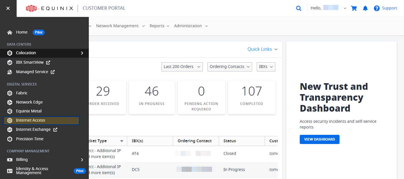
IBX Confusion: Many participants struggled to understand what "IBX" referred to. Most grouped related cards under terms like “Colocation,” leading to a significant shift in branding and marketing away from "IBX" to "Colocation."
Equinix Connect: This product value and what it does was not clear. Based on user feedback, it was renamed Equinix Internet Access, clarifying its function.
Packet and Metal: Packet, another Equinix product, lacked recognition among users. The rebranding to Equinix Metal provided immediate clarity, linking the product to Bare Metal offerings.
Quote from User:
“I have no idea what IBX means, but if this is about data centers, just call it that—Colocation makes more sense.” – Potential Equinix Customer
Phase 2: Gaining Stakeholder Alignment and Feedback (Cognitive Walkthroughs)
Between card sorting and usability testing, we conducted cognitive walkthroughs with 24 product experts, including UX professionals, Global Support Desk members, and Product Managers. These walkthroughs focused on eight high-traffic user flows, such as accessing billing, managing assets, and navigating support options, using the prototype with the new left navigation.
This exercise served two critical purposes:
Validate Usability: By asking participants to complete real-world tasks, we tested the effectiveness of the navigation in streamlining complex processes.
Address Stakeholder Concerns: Many stakeholders initially feared that the new structure would "bury" their product and reduce its visibility. Instead, these sessions demonstrated how the new IA elevated their products, making them easier to find and use.
Key Outcomes:
Participants experienced firsthand how the new navigation simplified workflows and highlighted their products more effectively.
Alignment across departments improved significantly, as stakeholders gained confidence in the redesign’s ability to enhance discoverability and user satisfaction.
Quote from a Product Manager:
“I was worried our product would lose visibility, but this structure makes it more prominent and easier for users to access.”
Impact:
This phase not only validated the left navigation prototype but also unified stakeholder support, paving the way for smoother implementation and cross-functional buy-in. It ensured the final design was not only user-friendly but also embraced by internal teams.
Phase 3: Gathering Feedback on Prototype (Concept Testing)
With the findings from the study insights and recommendations from the two rounds of card sorting activity, our designers we built a prototype of the new navigation and tested it with 12 participants from five countries. Participants responded positively to the new terms and structure, confirming the broader impact of the terminology updates.
Key Outcomes:
The left navigation was a hit. Participants described it as “organized” and “modern” while comparing it favorably to industry leaders like AWS and Azure.
Easily Understood: Naming tweaks like changing “Resources” to “Inventory” improved clarity. Terms like “Colocation” and “Internet Access” were immediately understood, reducing confusion.
Improved Discovery: Users discovered new products like Virtual Services for the first time, showcasing the potential of the left navigation to act as a product catalog.
Unified Branding: The use of “Colocation” across navigation, marketing, and content created a consistent and recognizable identity for Equinix services.
Quote from User:
“Equinix Internet Access makes perfect sense. I wasn’t sure what Equinix Connect was supposed to mean.” – IT Admin
The Transformation: Designing for Discovery
As insights poured in, we refined the design iteratively:
Navigation Structure:
Global tasks like "Orders" and "Billing" were prioritized in the top navigation.
Product-specific items were grouped functionally in the left navigation, using terms that resonated with users.
Customization:
We proposed dashboards with configurable widgets to empower users to tailor their experience.
Improved Accessibility:
Hover descriptions were added to reduce ambiguity.
Redundant links, like support options in both top and side menus, ensured critical actions were always findable.
The findings from card sorting and usability testing didn’t just shape navigation—they transformed how Equinix positioned itself to its customers. These changes rippled across branding, content, and marketing strategies:
Colocation:
Replaced the term "IBX" in all navigation and marketing materials.
Unified branding around a term that was immediately recognizable and intuitive.
Equinix Internet Access:
Clarified the purpose of "Equinix Connect" and aligned it with user expectations for internet services.
Equinix Metal:
The rebranding of "Packet" established consistency and clarity, tying the product to the broader Equinix portfolio.
The Result: A Unified, User-Centered Portal
The new portal wasn’t just a redesign—it was a reimagining of how users interacted with Equinix. The navigation system became:
Intuitive: Users could locate frequently accessed items in seconds.
Discoverable: Cross-product offerings like Virtual Services gained visibility, encouraging exploration.
Scalable: The IA was designed to grow with Equinix’s expanding portfolio, ensuring it would remain effective for years to come.
The impact extended far beyond navigation. By aligning the portal’s IA with user-friendly terms, Equinix achieved:
Clarity: Customers could now navigate the portal and understand marketing materials without encountering confusing terms.
Consistency: The adoption of terms like "Colocation" and "Equinix Internet Access" standardized the language across all touchpoints.
Discoverability: Simplified terminology helped users explore the full Equinix portfolio.
Quote from User:
“It’s so refreshing to see clear names like Colocation. It just makes sense now.” – Colocation User
The Impact: Redefining Equinix’s Identity
The feedback spoke volumes:
“It feels like a tool to access everything rather than just another product portal.” – Participant
“I didn’t know Equinix had Virtual Services until I saw it here. This is exciting.” – Colocation User
Quantitatively, the results were just as impressive:
83% of participants rated the new navigation as "intuitive."
100% successfully completed key tasks like locating Billing or Inventory in under three clicks.
80% users discovered new features or products they hadn’t previously accessed.
This project demonstrated the transformative power of user research. The terminology updates weren’t just cosmetic changes—they redefined how Equinix communicated its value to customers. By aligning its language with user expectations, Equinix created a cohesive experience that extended from the portal interface to global marketing campaigns.
Card Sorting (Initial Insights) → Identified IBX confusion.
Prototype Testing (Validation) → Confirmed user preference for functional terms.
Branding Updates → Rolled out “Colocation,” “Internet Access,” and “Metal” across marketing and content.